.png?width=212&name=Prospect%20by%20IrisVR%20Black%20(1).png)
Update: the issue has since been resolved since late 2016. If you're curious to learn more about our history and how we think about our software, keep reading!
In 2016 we released Prospect v1.0 after almost two years in development. This was a huge milestone for IrisVR - it was the culmination of our team's work across many codebases, and in our early tests we were seeing vastly improved framerates and 2x faster loading times. What we hadn't anticipated was the frustration from our users regarding the addition of a blue tint to their experiences. We began to call it blue-tint-gate and had a few emergency team meetings to address the issue.
The Problem
Our realtime daylighting system received an overhaul in v1.0, and this "better" version picks up on environmental cues to inform the color of the shadows in a model. The sky is blue, so it made our shadows blue. The position of the sun also informs the color of the light hitting materials. This is a rough approximation of how sunlight and shadows work in reality, so we viewed this as the best option for development. As you can see below, the results were... well... very blue.
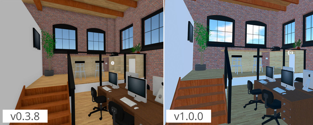 A comparison of our old beta build on the left and our release build on the right.
The Solution
Even with the blue wash, we generally preferred the graphics in the new build - the image was sharper, the sky was much more beautiful and dynamic, when in direct sunlight the space felt warmer - so we knew we couldn't throw out that progress to fix the blue tint. Instead we started testing saturation levels, and played with different shading options to see if we could keep some of the benefits of the new lighting system while toning down the sky intensity.
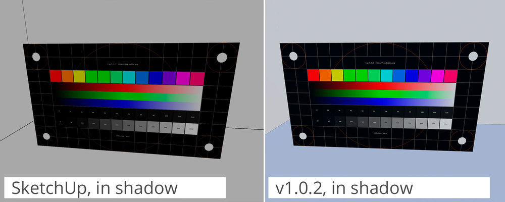
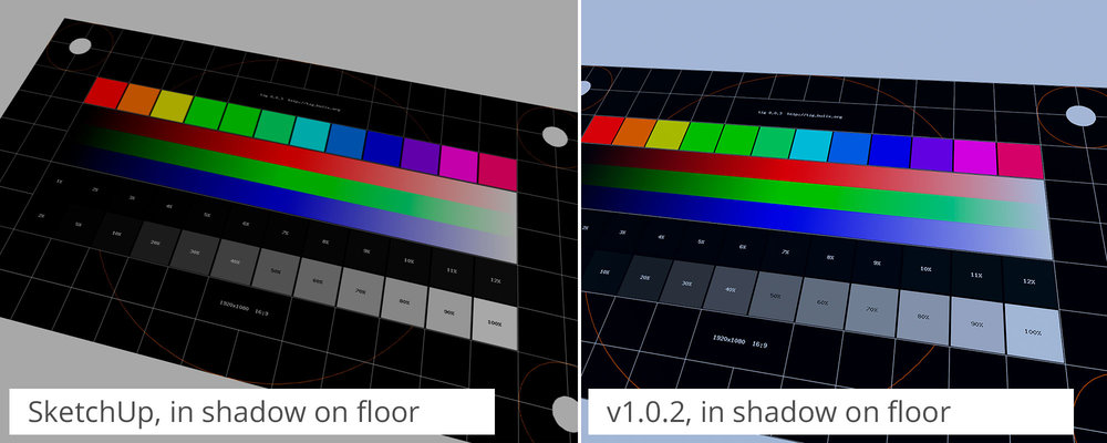
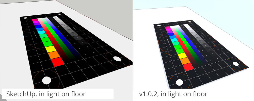
We had trouble landing on the right color balance because so many of these settings are subjective. Our solution was to gauge our success by how similar the Prospect screenshots were compared to the diffuse bitmaps from SketchUp, Revit, and Rhino viewports. We found a base color calibration chart and placed it in different lighting conditions in our scene. Here was the outcome:
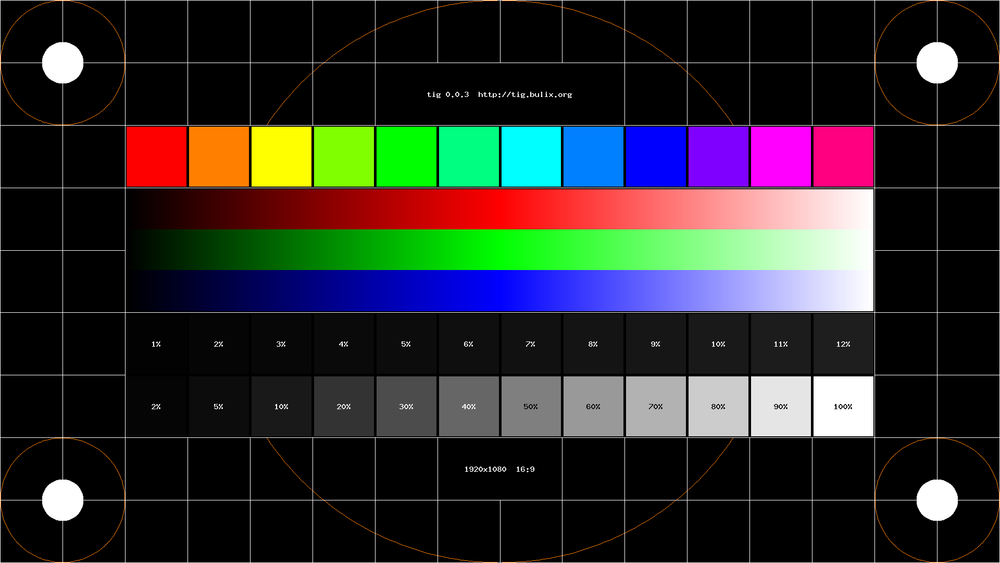 Our color calibration base image, sourced from: http://krazyblog.net/2014/12/display-calibration-in-phones-and-why-it-matters/
The Status of the Blue Tint Now
As you can see in the images above, we we're able to tone down the blue tint in most cases. In our latest build (Prospect v1.0.2) you will see these adjustments in your files. We decided to keep a slight blue tint on floors because it gives white models differentiation between surfaces, and helps clarify forms in interior spaces.
Going through this process we have a few major takeaways for the team:
- Even if a graphics enhancement is more physically accurate, it might not drive higher user satisfaction.
- For global lighting to work best, it needs to be a carefully calibrated system which calculates both ambient color and the color of interior spaces.
- Expectations of graphic representations within VR vary widely by user preference, project context and are often times based more on intuition than logical calculation.
What's Next?
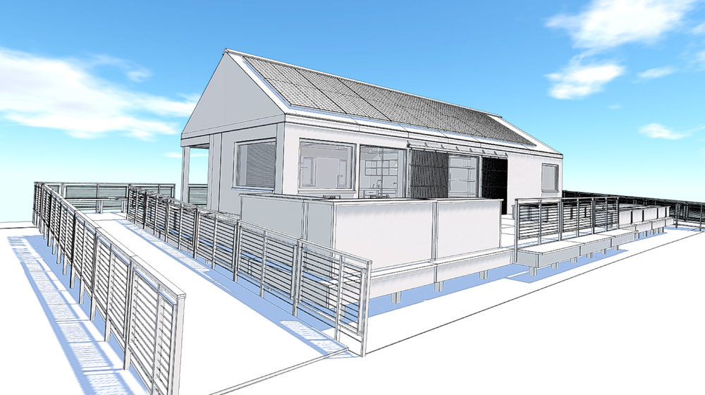
In the spirit of schematic design, we've been working on a few graphic styles that should make the in-VR experience really pop (sneak peek below). Stay tuned for more updates to Prospect and let us know what you think; the more precedents we have the better we can tailor our graphics to fit our users' needs. Alternatively, if you want to try the latest version of Prospect, sign up for a free 45-day trial below.
